Dark mode is now an essential feature for many iPhone users, providing a more comfortable viewing experience, especially in low-light conditions. However, while most apps support dark mode for their interfaces, some still feature glaring, bright icons that clash with the sleek, dark theme of the system. If you’re like me and prefer a cohesive look, here’s how I create dark icons for apps that don’t have them, making my home screen aesthetically pleasing and visually consistent.
Why Dark Icons Matter
Dark icons are crucial for maintaining a cohesive and visually soothing home screen when using dark mode. They blend seamlessly with the system’s overall design, reducing glare and eye strain. But some apps still feature bright, traditional icons, disrupting the flow. By creating my own dark icons, I can enjoy a unified aesthetic and customize my iPhone experience to my liking.
The Process of Creating Dark Icons
Here’s a step-by-step guide on how I go about creating dark icons for apps that lack them:
Find or Design the Icon
The first step is to find or create the dark icon. I prefer to start with a high-quality image or logo of the app that I want to replace. There are a few options for this:
Search for Icons Online: Websites like Flaticon, Icons8, or Noun Project offer free or affordable icons. I look for minimalistic designs that work well with dark mode.
Design My Own: If I can’t find a suitable icon, I use tools like Canva or Adobe Illustrator to design a custom icon. I choose simple shapes, solid colors, and a dark palette that fits the app’s brand while blending well with my dark theme.
Save the Icon Image
Once I’ve found or designed the perfect dark icon, I save it as a PNG or JPG file to my iPhone’s Photos app. It’s important to ensure the icon’s resolution is high enough to look sharp on the home screen.
Use Shortcuts to Replace the Icon
Apple’s Shortcuts app is essential for this customization process. Here’s how I use it to create shortcuts with my dark icons:
Step 1: Open the Shortcuts app on my iPhone.
Step 2: Tap the “+” icon to create a new shortcut.
Step 3: Select Add Action and then tap Scripting > Open App. Here, I choose the app I want to customize.
Step 4: Tap the three dots (…) in the corner of the new shortcut. This will take me to the shortcut’s settings.
Step 5: Name the shortcut and tap Add to Home Screen.
Step 6: Tap the icon next to the shortcut name and select Choose Photo. I then select my custom dark icon from my photo library.
Step 7: Tap Add, and my custom dark icon is now added to the home screen!
Organize Your Home Screen
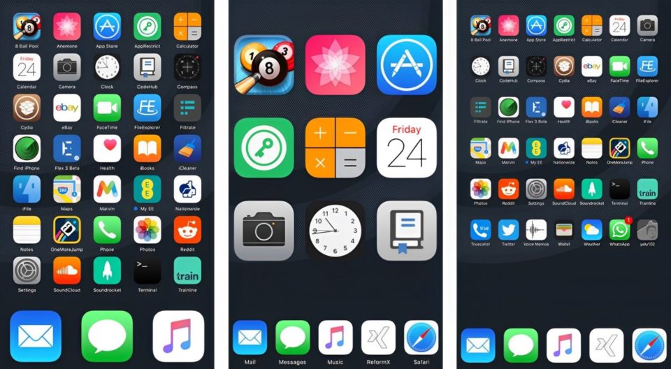
After creating the dark icons, I organize them by grouping similar apps together in folders. This gives my home screen a clean, minimalistic look that complements the dark icons.
Pros and Cons of This Customization Method
While creating dark icons is a great way to enhance the appearance of your iPhone, it does come with a few advantages and drawbacks:
Pros:
Customization: It’s a highly customizable solution that lets me choose exactly how my icons look.
Free and Easy: Most of the tools used for creating icons, like Canva or Flaticon, are either free or offer affordable versions.
Cohesive Aesthetic: The dark icons create a more uniform and sleek home screen, which looks much better when using dark mode.
Cons:
Shortcuts App Redirect: When using a shortcut to open an app, there’s a brief delay because the Shortcuts app has to open first before redirecting to the actual app.
Time-Consuming: It can take a bit of time to set up dark icons for multiple apps, especially if you want to replace all of them.
Conclusion
Creating custom dark icons for iPhone apps that don’t offer them is a simple yet rewarding process. The Shortcuts app offers a straightforward method for replacing default icons with personalized designs that match your aesthetic. Although the process may be slightly time-consuming and the shortcut redirection is not ideal, the results are well worth it. By taking control of the icons, I can enjoy a unified, sleek, and visually cohesive home screen that enhances my iPhone experience.
Ultimately, the freedom to personalize my device gives me more satisfaction and makes my daily interactions with my iPhone a little more enjoyable. If you’re tired of mismatched icons, give this method a try and elevate your iPhone’s appearance today!